P1: PRODUCE A PROPOSAL FOR THE ORIGINAL MEDIA PRODUCT TO MEET THE CLIENT BRIEF & P2: CREATE SAMPLE MATERIALS TO SUPPORT THE PROPOSAL
Brief
Paradigm Agency are a music marketing company who work with unsigned artists and get them into the music industry. They want a new intern to create the music promotion for a new band on their books. They would like you to plan and devise a music video and magazine two page spread.
Research into Similar Products
|
Klefi / Samed - Hatari Feat. Bashar Murad
|
RIP 2 My Youth - The Neighbourhood
|
Milano Good Vibes - Mahmood
|
|
For this brief, I have chosen to use the local artist Vin Yeti, a indie band based in Cambridge, and their song Secateurs.
|
|
Proposal
[Secateurs - Vin Yeti] Music Video
Plot Synopsis
A music video, in the style of a romantic drama, where a middle aged woman cheats on her husband before eventually leaving, but the entire narrative is reversed. We begin with a middle aged lady sitting on a park bench with no charge on her phone, having left her husband after an argument. Before they argue she plays an old favourite record and she is sat texting another man while her husband is gardening outside. We see them have lunch ‘together’ but they do not interact at all, showing their strained relationship. He picks at his food and does not eat it. Next he lies awake at night sleepless and then check her phone as it lights up with a message from the other man. He sighs and the video fades to black. Intermittently, throughout this narrative we have sections of performance as well; where the couple sing sections of the song. The entire video is shot in desaturated lighting to reflect the gloomy mood of narrative and I shall take inspiration for certain shots from Mahmood’s Milano Good Vibes and the film Black Panther.
Purpose
The main purpose of this music video is to spread the artist’s song hence boosting their popularity. However, there are some secondary purposes: to entertain; to educate on split parents and cheating; and to raise awareness about this topic.
Audience
The main genre of music fans I aim to appeal to is indie music fans. This is due to the band being a small local indie band and therefore I will appeal to this part of my audience by the techniques and style used in the music video. This also means there is a slight appeal to film fans due to the usage of different techniques and stylisation. The main social classes that are apart of my target audience are C1 And C2 due to the topics covered in the music video, however social class B is also part of the audience as they are the type of person that most likely has the freedom to explore smaller bands like Vin Yeti. In terms of age, young teens to the oldest young adults (13-30), as these are those who have grown up with this kind of music as well as have the skills to use youtube to watch the video. The types of people appealed to will be explorers & some strugglers; explorers are more likely to try a small local band as they want to find something new and strugglers seek an escape so music is a perfect choice.
Resources and Personnel
The main resources I will require to film this is a camera, here picture quality matters over sound quality as all sound recorded on set will be removed, and any props. Currently the main props that pertain to the storyline are: a phone, gardening tools, a record, a record player, food for lunch, and bedsheets to dress the set. I only require three people on set to make this music video and these are: myself (producer, director, cameraman, and editor); my mum (who shall play the role of the wife); and my dad (who shall play the role of the husband). I won’t require any extras as I want the couple to feel isolated and alone, therefore I shall make sure to keep any passersby out of my shots.
[Vin Yeti] Magazine Interview
Synopsis
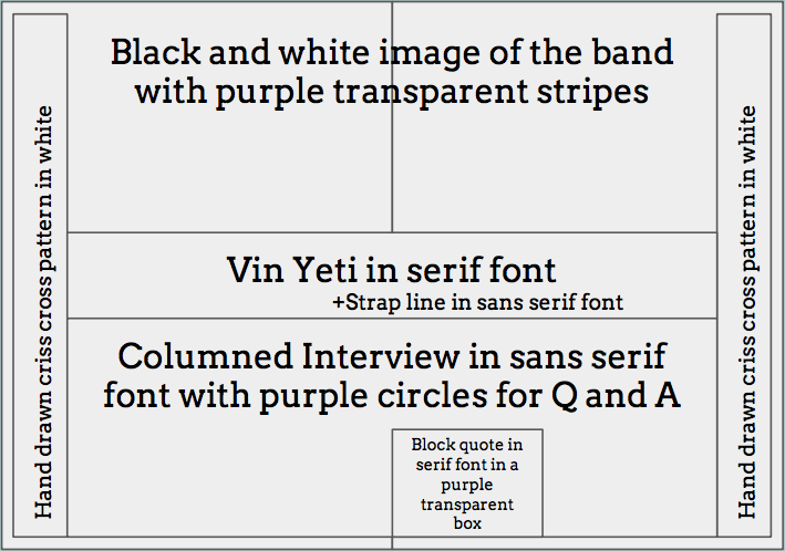
There are currently two layout options for the two page spread. These shall be forwarded to a focus group and I shall also conduct a survey to see which is preferred. The first plan involves a large black and white image of the band in the background with the name of the band across the middle of the spread in a serif font. Underneath this will be the strapline in sans serif font with an alley before the columned article. On the right page, there will be a block quote from the article in a transparent purple box to catch the eye of the reader; in addition, running down both edges of the pages is a hand drawn criss cross pattern.
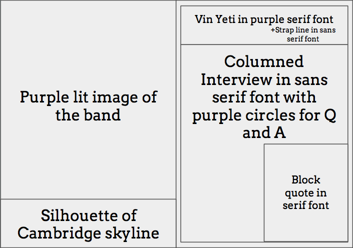
The second plan consists of a purple lit image of the band on the left hand page with a silhouette of Cambridge’s skyline at the bottom to emphasise that the band is local. On the right hand page, there is the name of the band at the top of the page in purple serif font with the strapline below in sans serif font. The interview is split into two columns using purple circles with letters in them to represent the question and the answer; as before there is a black quote in serif font taken from the article on the right hand side to draw the reader in.
Purpose
The main purpose of this music video is to inform about the band therefore spreading them as well as educating them on their influences. It is also to advertise the band and as a result persuade the audience to listen to the band thus encouraging them to explore local artists. Another purpose is to entertain the audience and provide an enjoyable read.
Audience
The main genre of music fans I aim to appeal to is indie music fans. This is due to the band being a small local indie band and therefore I will appeal to this part of my audience by the styles used in the article and heavily mentioning this in the strapline. The main social classes that are apart of my target audience are B, C1, And C2 as they have disposable income to spend on magazines for entertainment and to enhance their interests. To appeal to them the magazine article must appear as professional as possible hence I have completed research into other magazines. The audience is comprised of late teens to the oldest young adults (16-30) as these are those likely to actually spend money on magazines and read them. The types of people appealed to will be explorers; explorers are more likely to try a small local band as they want to find something new.
[Secateurs - Vin Yeti] Music Video
Plot Synopsis
A music video, in the style of a romantic drama, where a middle aged woman cheats on her husband before eventually leaving, but the entire narrative is reversed. We begin with a middle aged lady sitting on a park bench with no charge on her phone, having left her husband after an argument. Before they argue she plays an old favourite record and she is sat texting another man while her husband is gardening outside. We see them have lunch ‘together’ but they do not interact at all, showing their strained relationship. He picks at his food and does not eat it. Next he lies awake at night sleepless and then check her phone as it lights up with a message from the other man. He sighs and the video fades to black. Intermittently, throughout this narrative we have sections of performance as well; where the couple sing sections of the song. The entire video is shot in desaturated lighting to reflect the gloomy mood of narrative and I shall take inspiration for certain shots from Mahmood’s Milano Good Vibes and the film Black Panther.
Purpose
The main purpose of this music video is to spread the artist’s song hence boosting their popularity. However, there are some secondary purposes: to entertain; to educate on split parents and cheating; and to raise awareness about this topic.
Audience
The main genre of music fans I aim to appeal to is indie music fans. This is due to the band being a small local indie band and therefore I will appeal to this part of my audience by the techniques and style used in the music video. This also means there is a slight appeal to film fans due to the usage of different techniques and stylisation. The main social classes that are apart of my target audience are C1 And C2 due to the topics covered in the music video, however social class B is also part of the audience as they are the type of person that most likely has the freedom to explore smaller bands like Vin Yeti. In terms of age, young teens to the oldest young adults (13-30), as these are those who have grown up with this kind of music as well as have the skills to use youtube to watch the video. The types of people appealed to will be explorers & some strugglers; explorers are more likely to try a small local band as they want to find something new and strugglers seek an escape so music is a perfect choice.
Resources and Personnel
The main resources I will require to film this is a camera, here picture quality matters over sound quality as all sound recorded on set will be removed, and any props. Currently the main props that pertain to the storyline are: a phone, gardening tools, a record, a record player, food for lunch, and bedsheets to dress the set. I only require three people on set to make this music video and these are: myself (producer, director, cameraman, and editor); my mum (who shall play the role of the wife); and my dad (who shall play the role of the husband). I won’t require any extras as I want the couple to feel isolated and alone, therefore I shall make sure to keep any passersby out of my shots.
[Vin Yeti] Magazine Interview
Synopsis
There are currently two layout options for the two page spread. These shall be forwarded to a focus group and I shall also conduct a survey to see which is preferred. The first plan involves a large black and white image of the band in the background with the name of the band across the middle of the spread in a serif font. Underneath this will be the strapline in sans serif font with an alley before the columned article. On the right page, there will be a block quote from the article in a transparent purple box to catch the eye of the reader; in addition, running down both edges of the pages is a hand drawn criss cross pattern.
The second plan consists of a purple lit image of the band on the left hand page with a silhouette of Cambridge’s skyline at the bottom to emphasise that the band is local. On the right hand page, there is the name of the band at the top of the page in purple serif font with the strapline below in sans serif font. The interview is split into two columns using purple circles with letters in them to represent the question and the answer; as before there is a black quote in serif font taken from the article on the right hand side to draw the reader in.
Purpose
The main purpose of this music video is to inform about the band therefore spreading them as well as educating them on their influences. It is also to advertise the band and as a result persuade the audience to listen to the band thus encouraging them to explore local artists. Another purpose is to entertain the audience and provide an enjoyable read.
Audience
The main genre of music fans I aim to appeal to is indie music fans. This is due to the band being a small local indie band and therefore I will appeal to this part of my audience by the styles used in the article and heavily mentioning this in the strapline. The main social classes that are apart of my target audience are B, C1, And C2 as they have disposable income to spend on magazines for entertainment and to enhance their interests. To appeal to them the magazine article must appear as professional as possible hence I have completed research into other magazines. The audience is comprised of late teens to the oldest young adults (16-30) as these are those likely to actually spend money on magazines and read them. The types of people appealed to will be explorers; explorers are more likely to try a small local band as they want to find something new.
Pitch
|
|
|
Fonts & Colour Palette
|
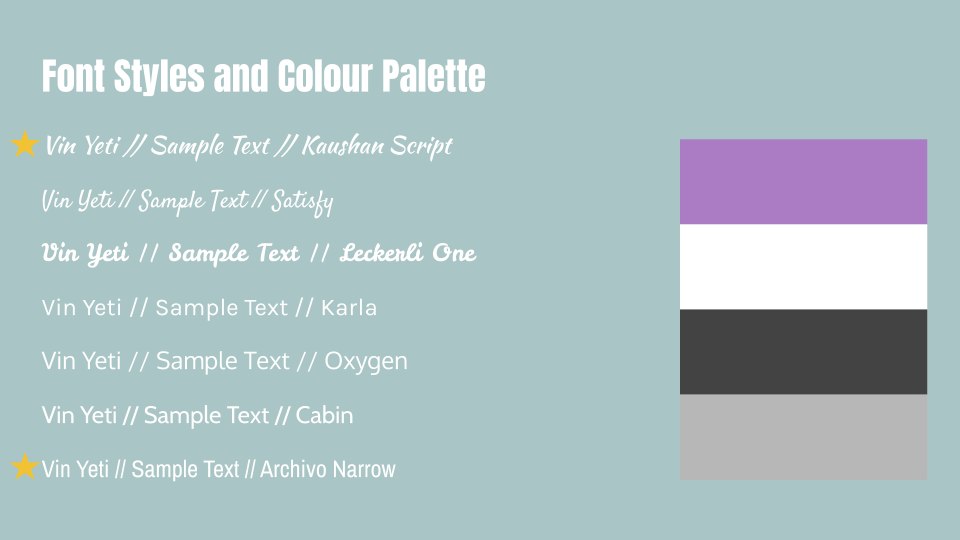
The two fonts I have chosen from my selection are Kaushan Script and Archivo Narrow; I will use the serif font (Kaushan Script) for the headline of the interview and then the sans serif font (Archivo Narrow) within the copy. This will help catch the eye of the audience but allow them to easily read the article therefore there is a higher chance of the article successfully completing its purpose.
The colour scheme I have chosen for the magazine article includes lilac, white, grey, and dark grey. This choice of one brighter tone with a monochrome set allows the lilac to be utilised in such a way that it grabs the attention of the audience. |
|
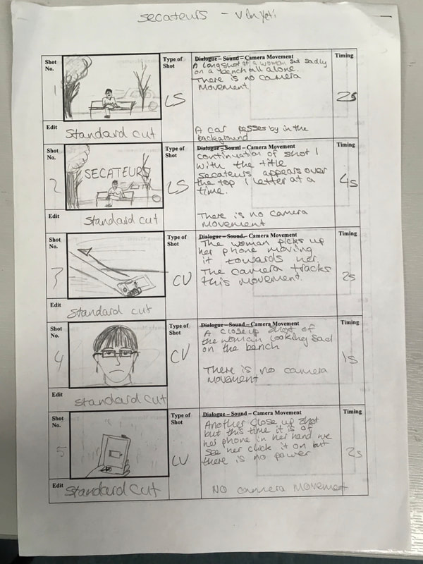
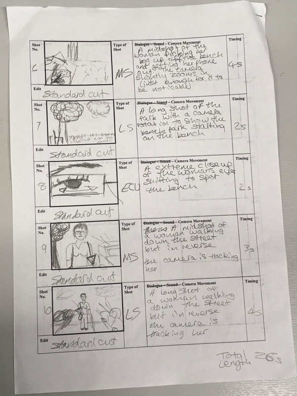
Music Video Storyboard
|
|
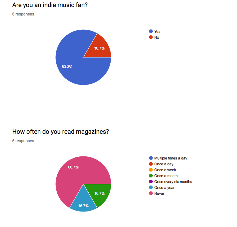
Analysis of Audience Research
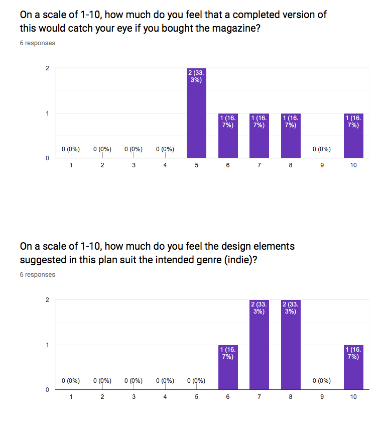
Out of those surveyed, 83.3% said that they were an indie music fan therefore making my sample suitable but also hence proving the popularity of this type of music and its suitability for use with this brief. However, the majority of those surveyed did not read magazines. This means that on one hand their views could inaccurate as they are unfamiliar with the media type, however it could also mean their views are more accurate in terms of whether these flat plans would catch their eyes as it must actually stand out for them to read it.
|
Out of the two flat plans people preferred the 2nd one and hence rated it higher on scales of 1-10. It was said to be more eye-catching and this may be due to the suggested idea that there will be increased contrast for the interview making it bolder when flicking through the magazine. It was also rated higher in terms of suitability for the genre and this may be due to the popularity of minimalism in the indie genre with flat plan 2 expressing this the most. When given the option between the two flat plans the 2nd won the majority and therefore this will be the final flat plan I use going forward.
|
|

|
|

|
M1: JUSTIFY CONTENT, DISTRIBUTION, AND MARKETING METHODS IDENTIFIED FOR THE PLANNED PRODUCTION TO MEET A CLIENT BRIEF
Justification
Content
One of the major aspects of the music video is that the entire narrative is in reverse. This is done because it creates an enigma code for the audience therefore keeping them watching and the video will gain more views. The amount of views the video receives is very important as it will be distributed on youtube where the more views a video has the more it is recommended to other users thus spreading it more and more (a little bit like two step flow). Additionally, by having the narrative in reverse it adds a second layer of meaning to the music video in that many people feel as though when their parents break up everything they've ever known is falling apart and they want it all back together just like how the characters in my music video will move back closer together over the course of the song. Moreover, it juxtaposes the song that will be travelling forward in time (compared to the narrative going backwards) and this creates a bittersweet atmosphere that will build on the husband's feelings when he finds out his wife is cheating on him.
The music video opens with a long shot of the wife alone on a bench in the park. The reason I chose this is that it establishes the location and situation to the audience by showing how alone she feels in a place you are meant to visit happy with your friends. The video will start with very desaturated lighting and slowly gain saturation over the course of it to show how the decay of the couple's relationship has caused their feelings to drop. Also, this has been done in order to help fit the music video into the common conventions of the indie genre thus possibly catching the eyes of other indie band's fans. Another way I could do this potentially is by shooting the video in 21:9 as opposed to 16:9 to give the music video a more cinematic look.
Throughout the video there will be splices of performance elements where the couple will sing parts of the song to the camera separately. I made the choice to have them sing separately to really emphasise how the only reason they are staying together is because they feel obligated to rather than for love. The performance elements are apart of this because the purpose of the music video is to advertise the band and therefore the song should be just as prominent as the story. In addition, it shows to the audience that the song is popular and they must enjoy it too.
The most major contrast in the magazine article is the purple lit image of the band on the left page and the actual article on the right page. This has been done to help catch the eye of the reader as both elements will stand out to them on a flick through due to this. Additionally, this contrast increases the legibility of the article hence it is more likely to complete its purpose in advertising and marketing the band to a larger audience. Within the copy this contrast is then continued via the the lilac circles that will have either a 'Q' or an 'A' inside them to represent the questions and answers. These circles will stand out against the clean minimalistic white backdrop of the article therefore telling the reader at first glance that this is an interview. At the bottom of the main image of the band, there will be a silhouette of the Cambridge skyline. This has been done to show the bands origins and further express how local they are to this area.
The headline of the article will be in a lilac serif font called Kaushan Script and shall simply be the name of the band, Vin Yeti. This handwritten looking font will stand out to the reader and draw their eye while also the short title will help convey the article's main interest fast. Moreover, the lilac will link to the circles used within the copy and in particular to the purple lit image of the band on the opposite page. This helps create a house style for the two page spread, which then creates an appeal for the readers as they feel that the content will be well made and are thus more likely to read the article. The rest of the copy will be printed in a dark grey sans serif font called Archivo Narrow as this is easier on the eyes for long term reading, which is what we want in terms of promoting the band. It also is high contrast with the backdrop, which as previously mentioned is ideal.
Distribution
The music video shall be distributed via youtube. This is because this is the most popular viewing platform for the target audience for videos that aren't TV or film - likely due to the popularity of influencers. It is important for the music video to reach the largest audience possible as this is the main major way of advertising the band to this generation due to not many people picking up magazines anymore.
The magazine article would be compiled with many others if actually distributed and produced by a UK print company such as Seymour (a joint venture between Bauer Media, Immediate Media Company, and Haymarket Publications) or Warners Group Publications. This would be done as opposed to independently printing and distributing the article as it needs to be with other material to sell well as people need a variety of entertainment.
